
I built this website back in 2008, initially without any real plans for what I was going to do with it, it was simply a way for me to practice my web design skills & experiment with SEO. This post details the original intention & the re-builds / re-designing of ModRed Design through the ages.
Website in 2008
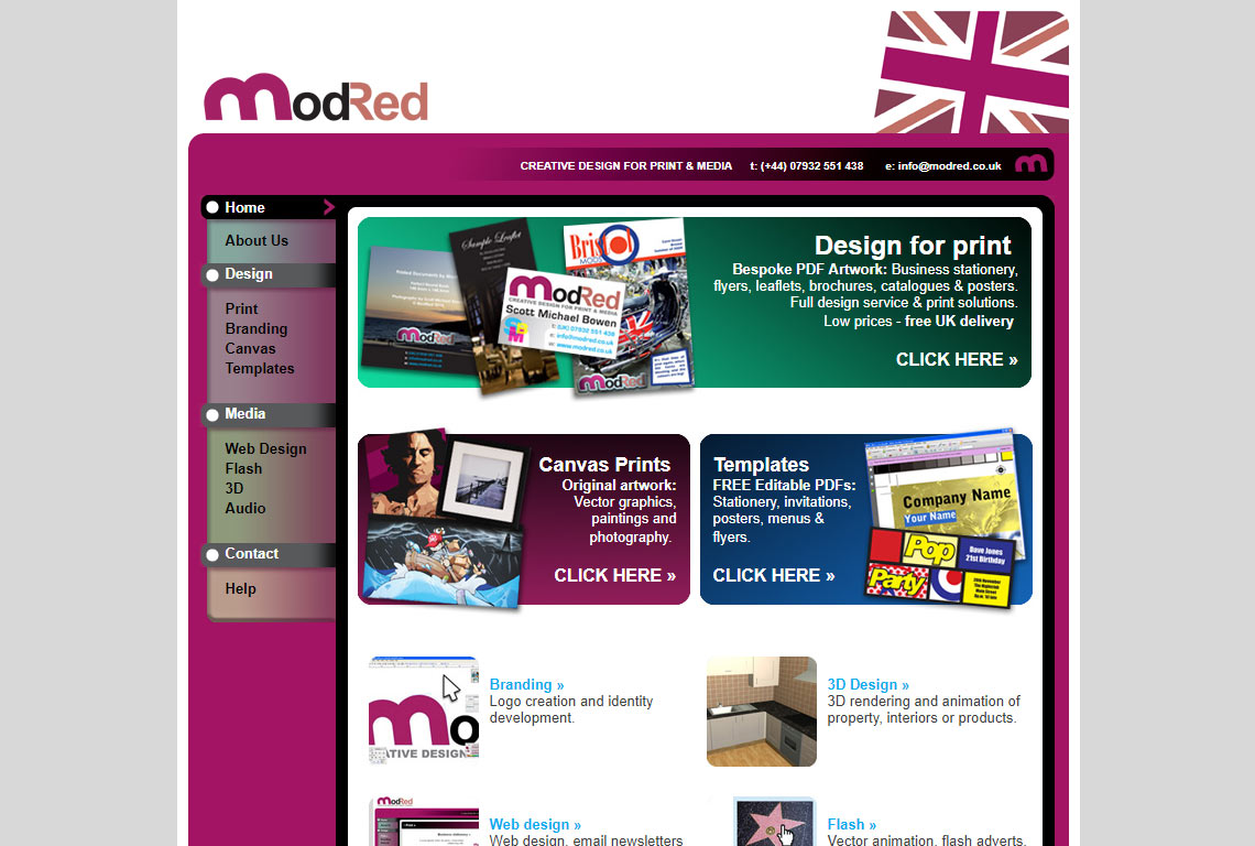
The name ModRed doesn’t mean anything… I just wanted a short domain name with a colour involved somewhere. Above is an image of the first design of ModRed – back then I had a full time job & was just building it as a project. I wasn’t sure what I wanted to do with it – but wanted to get first hand experience of building a website from scratch.
The website was built using HTML tables – as I was initially a HTML email designer, which do not make use of CSS or other helpful tools – and I knew how to do almost anything with tables, in web layout, positioning terms.
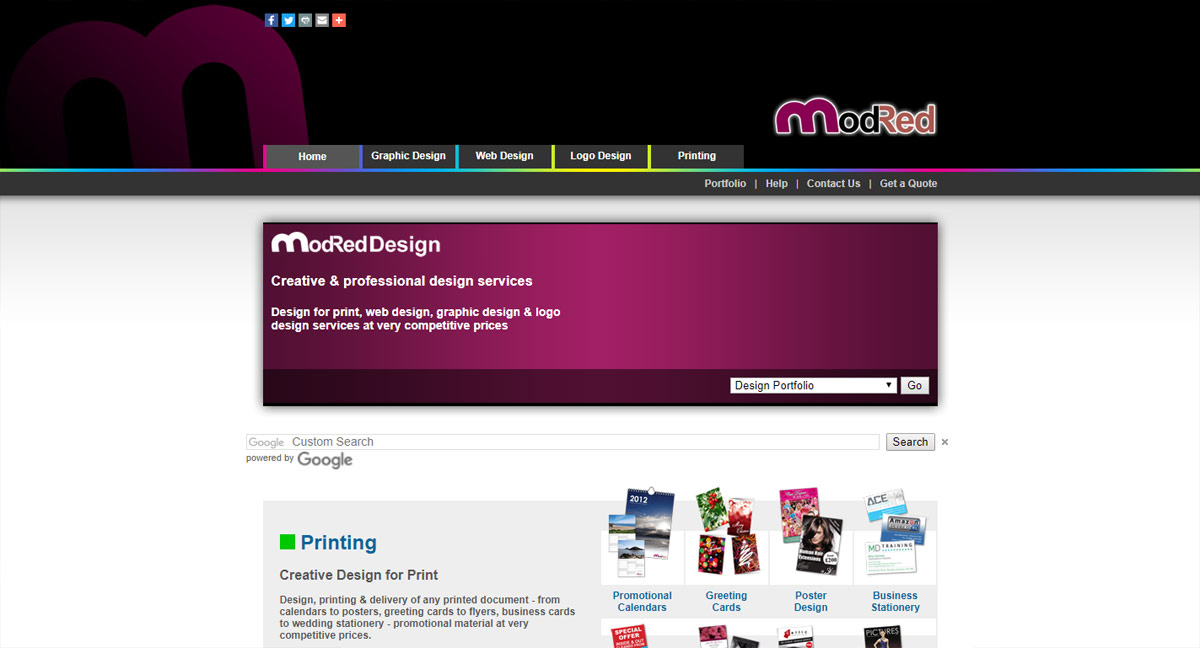
Website in 2010
In 2010, I decided to re-build the whole site, taking some of the skills I had picked up from various jobs to make the site look more interesting.
This version also used HTML tables, making use of opaque PNG images for cell backgrounds – creating a nice effect with a fixed attachment background image. I realised that 24 bit PNG files weren’t supported by some older browsers… so I later decided to remove the opaque backgrounds.
I also used some space to place AdWords – hoping I would make some easy bucks when hundreds of people clicked on them. It didn’t quite materialise!
Perhaps my SEO skills were not up to scratch.. but I think the site looked cool. Although, opaque PNG imagery doesn’t render in some older browsers, so I decided to re-build it again.
Website in 2011
This was the re-design in which I tried to focus much more on SEO techniques & browser compatibility. It still used some HTML tables, but with more CSS divs & styling.
ModRed – version 4 used a mixture of CSS styling, HTML tables, PHP programming & a little Javascript. I tried to make it more search engine friendly, fast loading (using PNG-8 imagery where possible) & mobile friendly.
The website was performing fairly well in search engines. Any local searches concerning graphic design listed me in the top 10 – often number one. In national search results it ranked quite well when searching for “design for print” or “bespoke calendars” along with a few more random searches.
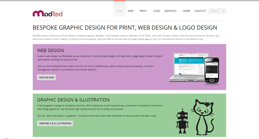
Website in 2013
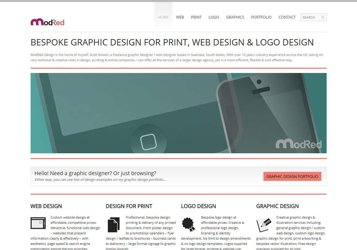
ModRed – version 5, released in February 2013. After working on a number of WordPress websites, I decided to create a WordPress site for myself. The site theme is fairly clean & minimal – it is also mobile friendly / responsive, so it will adjust the layout automatically to suit whichever device the visitor is using – mobile handset, tablet or laptop.
Website in 2014
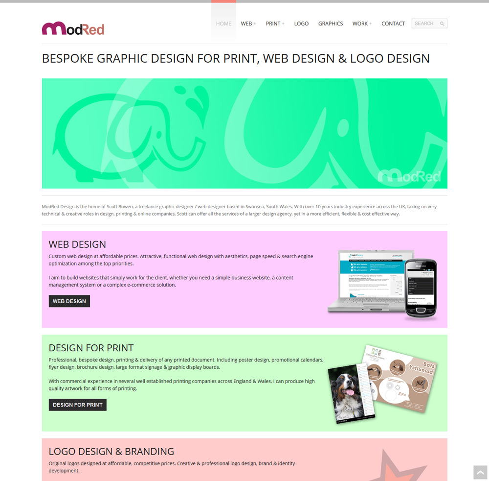
Added a bit of colour to the home page… just to mix it up a bit & give visitors big buttons to click on.
This version uses a mixture of CSS & old style HTML tables, to ensure compatibility across all browsers & devices. You can test if a website is responsive by simply shrinking the browser window… hopefully my site should re-size itself in an orderly fashion! If not, please let me know.
I also changed all the SEO titles, intending to improve rankings by creating more precise page titles… which is working nicely so far. When changing the whole website SEO, I expected a bit of a dip in rankings, followed by an improvement. This has to be done as we live & learn.
Website in 2015
I decided to tone down some of the colours used on my homepage, to be a little less garish. I also removed the home page slider, using simple coloured sections to promote the main services offered – to see if it made any difference in user navigation.
Website in 2017
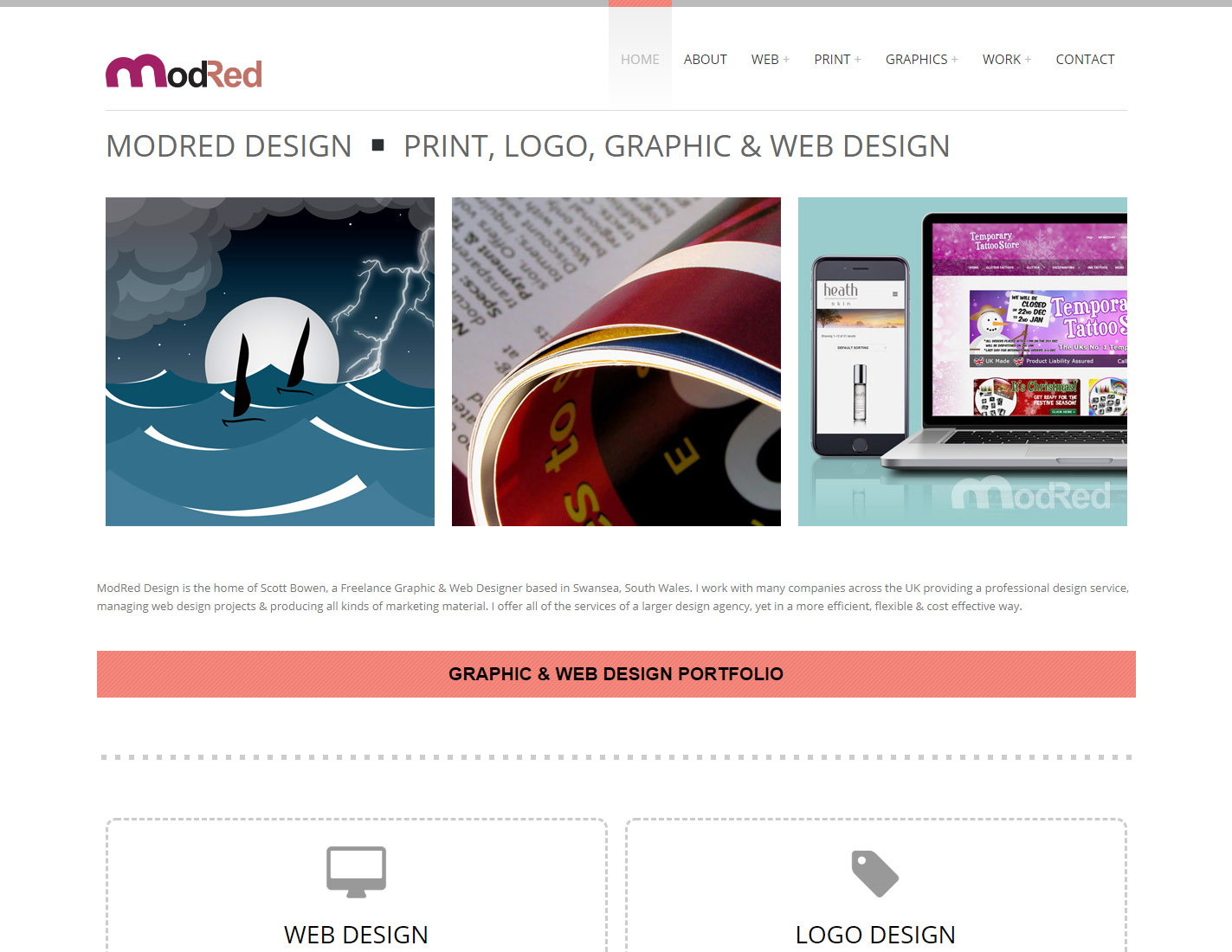
I decided to re-introduce the home page slider – using square close-up images of design projects. I also created 4 service blocks – using Font Awesome icons and a dashed line border to give definition.
Going further into the website, I have made all of the main service pages quite similar to the home page, using the 3 square images at the top & making the pages full width, using responsive columns to better lay-out the content.
Website in 2019
After working on many different web design projects, I decided that I wanted to simplify my own website… making it as quick loading as possible and to make it much clearer for visitors, by reducing / fine-tuning the text on most pages & reducing the menu options.
I also removed a few of the smaller projects from my design portfolio, intending to focus on the larger, more detailed projects & improving the content on each.
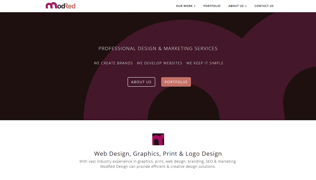
Website in 2021
Keeping the simple, minimalistic style, but re-introducing a slideshow on the home page to provide a bit of motion. Like the previous web design in 2019, I wanted to make navigation as easy as possible, for all possible devices.
The design & layout has not changed a lot, but the menu system has been updated to be more mobile-friendly. I re-introduced the search system and the grid layout portfolio, which seems to work better on all devices. I also reverted to a more traditional footer – with the standard menus & social media links.
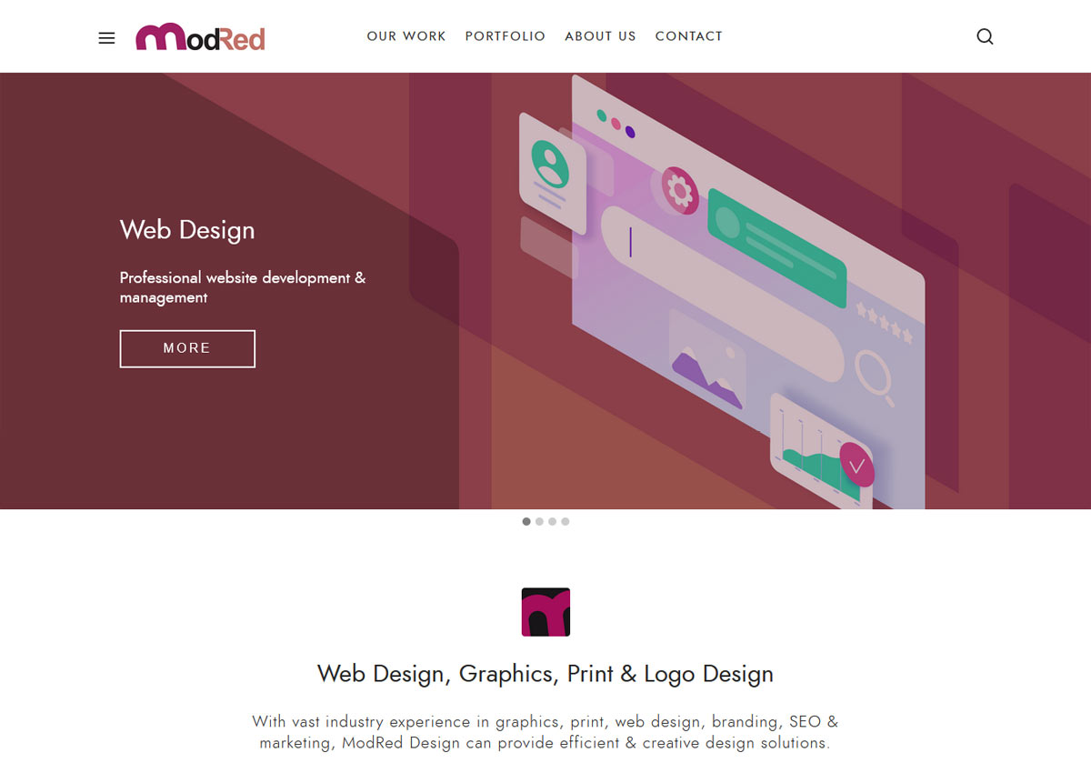
Website in 2025
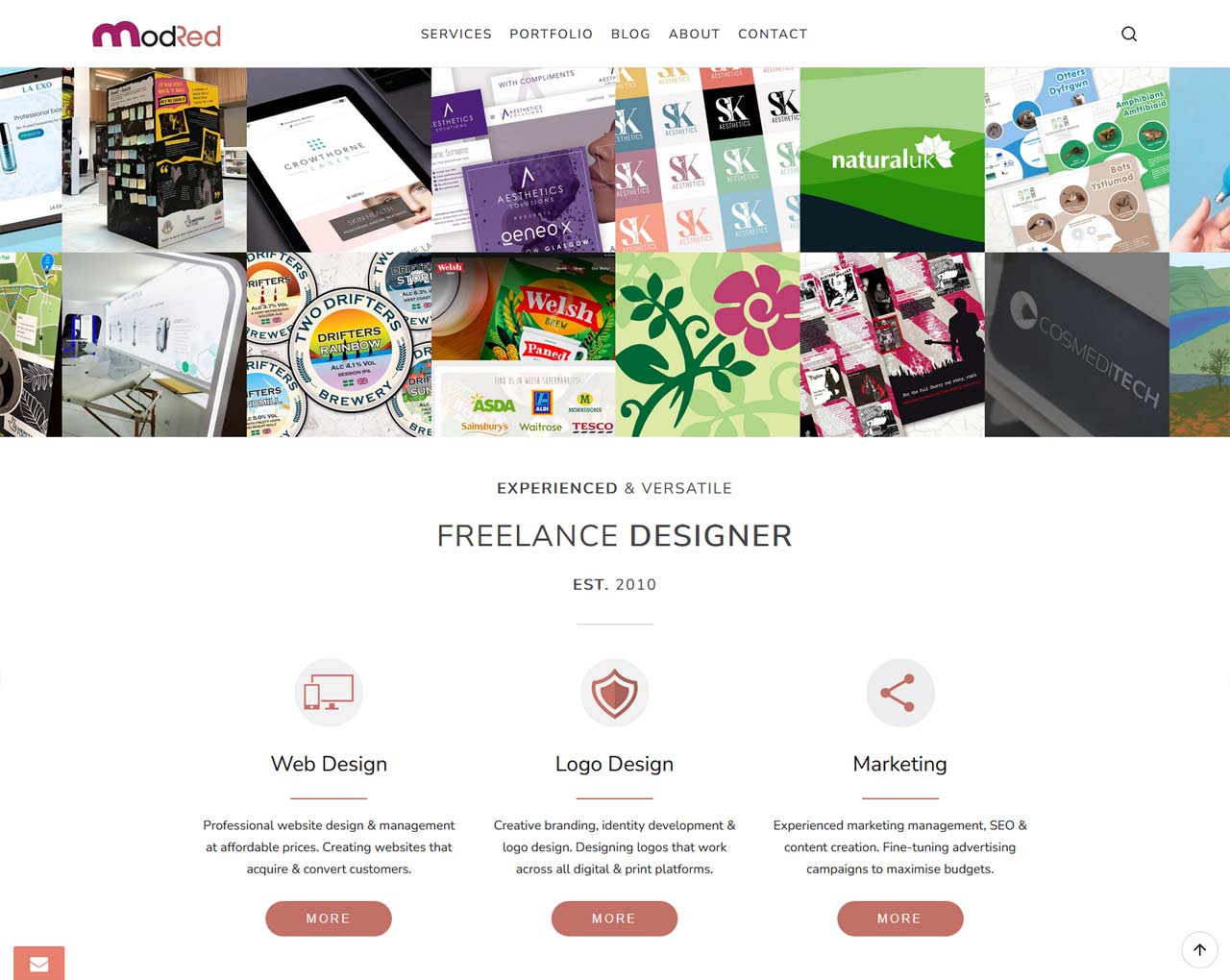
I decided to replace the home page hero slider with a selection of square image tiles to showcase my portfolio of design projects. I also created a series of custom icons to visually introduce each design service. To improve the loading speed on the home page, I replaced the MP4 video showcase with a YouTube video, so the loading time is slightly quicker, and I believe YouTube videos can be valuable for Google search results, occasionally being shown as part of your snippet. I also changed the buttons style from rectangular outlines to rounded full colour buttons.
Alongside the visual changes, I went through the website with a fine tooth comb! And it’s surprising how many issues you can find, if you don’t regularly check your website. Simple things like broken links can make a huge difference to your SEO rankings, so I removed any broken links and slightly improved my SEO.
SEO Changes
In 2025 I decided to rethink my SEO approach. Instead of targeting local customers, I decided to try going national. For this kind of approach you need to be quite specific, so I decided to target the phrase “Freelance Designer” which is working quite effectively on Bing, but still some way to go on Google!
The evolution of a website never stops! There are always things to improve upon, things to learn about, regarding SEO – and things to make more compatible on the latest devices. You have also got to keep checking out the competition… if you are dipping in the search engine results, then you need to make some changes… but how do you know what changes are the right changes?
It’s always a good thing to read about the latest trends & techniques in web design – like the Google Search Central Blog – and there are a few great sites out there with lots of useful, relevant articles that tell you what is happening in the real world. Then try to apply these techniques to your own website.