I am often required to design & supply large format print design graphics for a number of clients, to be printed as exhibition installations, posters or banners. When creating large format artwork it is important to know how the printing process handles certain graphic file types, and how to manipulate the artwork to achieve crisp graphics… while also keeping the file size as low as possible.
Print design & artwork size
When creating large format print design graphics, using vector artwork is absolutely vital & imagery should be used only when necessary. The reason for this is because vector files will be many times smaller in file size than say a JPG file produced in Photoshop. And vector graphics can be scaled up to any size, without losing any crispness when printed.
To produce high quality, large format print design, it’s essential to use software like InDesign or Quark Xpress. Photoshop should be used only to edit images… not print artworking. Also, using software like InDesign takes far less computing power… which means less time opening files, less file space used… and less chance of something crashing.
Most printing companies will require a PDF for printing, because PDF files were created mainly for this purpose. Unlike documents like Word files, PDFs should look exactly the same on any computer, and will print exactly how you see it. If they are created properly, PDFs will also be far smaller in file size… hence the name Portable Document Format.
Using Vector Graphics
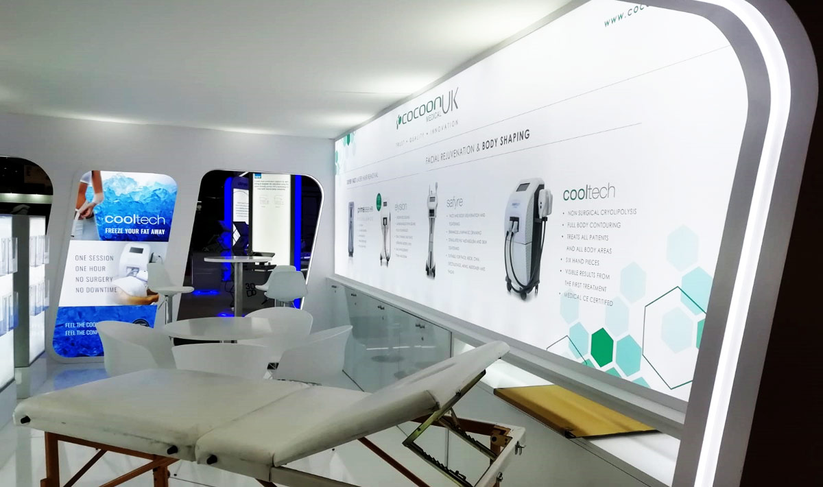
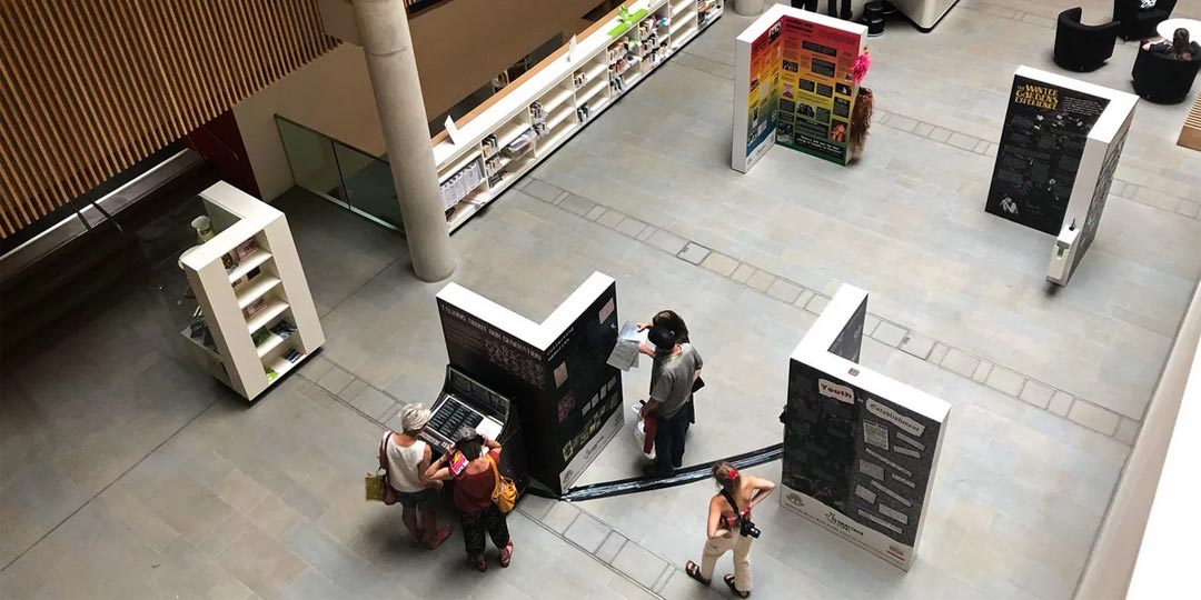
Take the graphics pictured below – this finished display was printed over 6 meters wide and around 2.4 meters tall – yet the PDF file I supplied for printing was just over 1 MB. This is because the only images used in the graphic are the 3 machine photos, the rest is created using vector graphics.
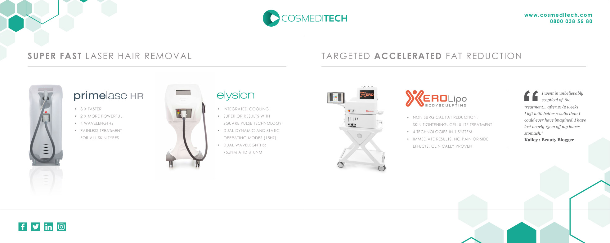
Producing the print design above – even at 25% size – would be unrealistic using software like Photoshop, as the file size would be well over 350 MB, rather than 1 MB. The main reason for this is because white colour equals zero information. Paper is usually white, so you are applying zero ink to any area that is white.
Sometimes, when designing large format print design graphics, it is tempting to fill the available space with lots of marketing messages. But it’s far more effective to keep the text minimal, so the main sales messages are readable at a fair distance. And try to use generous margins & columns, so the graphics look well balanced & nicely spaced.
Consider the location
It’s also important to know the physical space where the graphics are displayed, so you are not hiding some important elements behind a desk… so try to keep the important information in the top half of the design. Or if you know the artwork will be in an open space, you can use the entire height for graphic content.
When supplying large format print design graphics, depending upon the size, sometimes it is necessary to create a scaled down version of the graphics – say 25% scale. In this situation, I will export the PDF files setting the resolution at 600 DPI.
So when the file is scaled up by the printer, any image files will be printed at 150 DPI – which is perfectly acceptable for very large displays. For extremely large displays, you can get away with imagery at 72 DPI.
Using modular display panels
Some exhibition displays are made using modular panels, so it can be reconfigured & used for future exhibitions – re-building the display to fit the area provided.
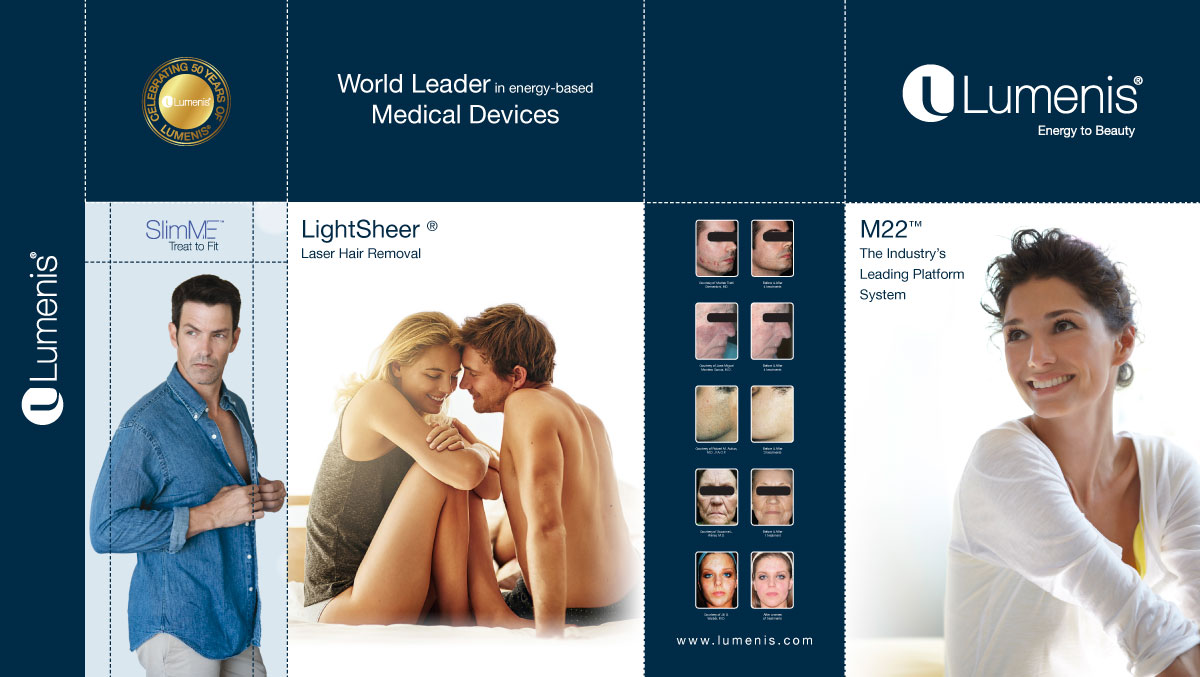
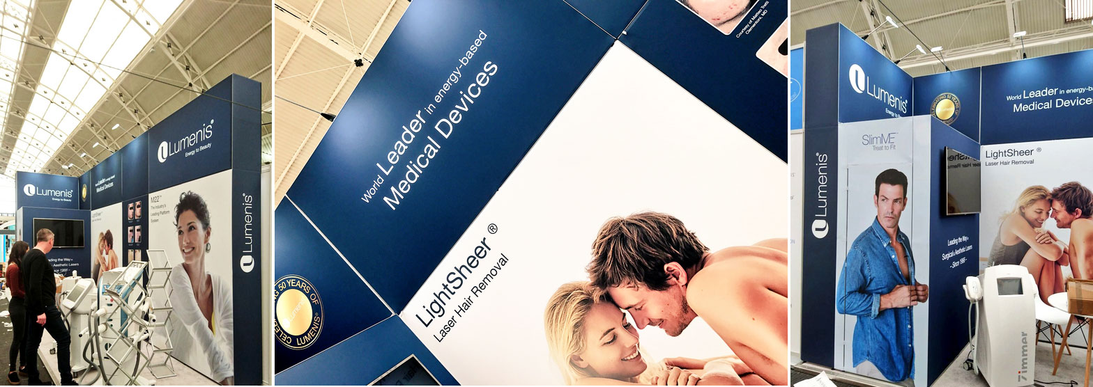
Above you will see the basic print design for one of these modular panel displays. The above graphic was supplied to the company to see the overall design – and below shows you how the modular panels were configured in the 3D space.
For future exhibitions, they may require one or two new panel designs to market a new product – but the older panels can still be reused & reconfigured.
Using CMYK inks & colour profiles
For optimum results when using images, I would use CMYK TIFF images at 300 DPI resolution – creating the TIFF file using the same computer, or same colour profiles used when exporting the finished PDF. This ensures that all CMYK colours will be printed exactly the same.
However, if the images used have a white background, I have found that using high-resolution RGB JPG files will work just fine. You are simply relying on the printing equipment to convert the graphics into CMYK when the artwork is Ripped… so if there are no overlapping colour elements, you can safely say that there will be no unwanted colour shifts in the finished print.
Using CMYK colours with images
To minimise the size of an image used in the finished print file – hence reducing the file size – you can use CMYK colour blocks to fade the image into.

As seen above – I have faded the image into a block of colour. The image to the left of the white dotted line is a CMYK TIFF file, where I have used Photoshop to apply a colour gradient to the right edge. Then, to the right of the white dotted line, I have used a block of colour, taking the exact CMYK values to ensure the colour is seamless.
Mixing CMYK colours
When using blocks of vector colours – or large areas of CMYK colour – I advise mixing the CMYK inks to achieve a richer colour. For example, to achieve a rich black, using 40% of Cyan, Magenta & Yellow… along with 100% Black, will give you a much deeper black colour. If you were to use just 100% Black, you would probably find the colour is a little faded or pasty.
This technique also works with greys & any other colour… by adding a small percentage of each other CMYK colour, you are making the printer apply more layers of ink to the paper, creating a deeper shade.
Single colour for text
However, mixing colours is not advised when colouring small text. In this case, depending upon the printing equipment, if the colours are even slightly out of line, this will be very noticeable on text, creating the blurry effect you occasionally see in magazines. This is very unlikely to happen in large format printing, but it’s always good to eliminate any possible issues before it’s printed.
Image resolution
As mentioned before, for very large graphic displays you can get away with using images at 72 DPI. But, if possible, set the resolution to about 100 DPI – this will make the image fairly crisp, but not too large in file size.
Occasionally a printing company will reject your artwork if your images fall below a resolution level, 300 DPI is the standard resolution required for normal sized printing… but in large format printing this is sometimes unnecessary.
If it is not possible to get an image with the required resolution, you can cheat by simply increasing the image file size in Photoshop – make the resolution 300 DPI and the physical size as large as required. Obviously you will lose the crispness & quality, but Photoshop will do a much better job than any printing RIP software.

Above you can see how an image loses it’s quality when increased in size. The image on the right (above) is increased in size by 400% (effectively reducing the resolution to 25%) and you can see how the crispness is lost. On some occasions this is acceptable for large format banners that are only seen from a distance, and if there are no alternatives.
The finished artwork
When the artwork is finished – it’s always good practice to outline all fonts. This turns any font into vector artwork… basically turning each letter into a shape. Most printing companies don’t require this, but depending upon the RIP software, occasionally fonts can be lost or not rasterized – ruining your design!
And it is often totally unnecessary to add colour bars & registration marks. These are usually removed, then re-added by the printing company, who often have their own unique set of print marks. I usually just add crop marks & sometimes bleed marks, to give the pre-press guys a visual reference for cutting.
Print design projects…
See a number of print design projects below, or view more on our portfolio
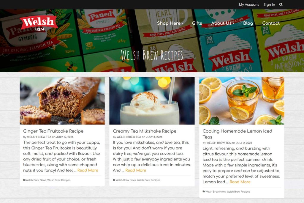
Welsh Brew Tea Recipe Blog

Commercial Cleaning Web Design
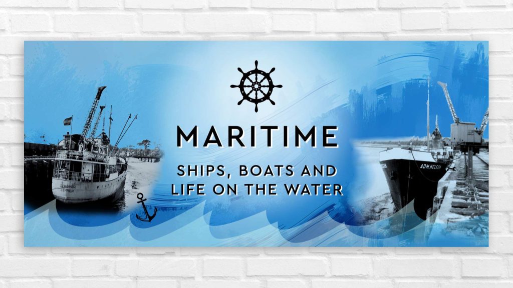
Heritage Graphics Installation Designs
Aesthetics Web Icon Illustrations

Heman Health Web Design